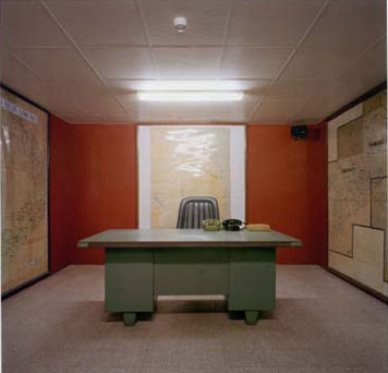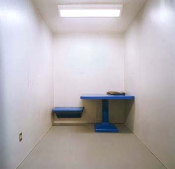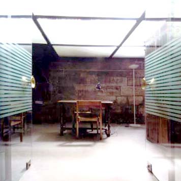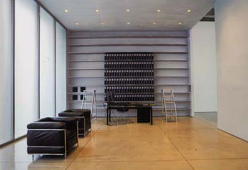
"Communications office bunker below the Imperial Palace, Ho Chi Minh City, Viet Nam," photograph by Richard Ross, Architecture of Authority, 2007
Looking to get a travel visa, I recently made my way to the Permanent Mission of the Socialist Republic of Viet Nam to the United Nations. Whooshing through the revolving door and into the United Nations Plaza, the usual trappings of New York City office-building lobby life were all present: guards behind the desk, bag checks, Tensabarrier lines, sign-in sheets.
Emerging onto the fourth floor, I again felt a rather familiar feeling descend. The hallways, buffed and polished with ancient strata layers of industrial-strength wax, were lined with solid metal doors, each painted the same, Pantone-exact shade of dark gray. The doors were marked with standardized nameplates, each bearing the name of semi-official, semi-dubious import-export agencies and the like. Entering the Mission, I saw a gilt-edged clock in the shape of Viet Nam to the right, and a florid portrait of Ho Chi Minh to the left (a curious departure, I thought, from the usual practice of putting the current head of state on display). As there was a short queue, the small row of chairs occupied, the man behind the desk ushered me into a nondescript back room, where I leafed through old ASEAN trade reports.
Soon grown bored with rice harvest estimates, I began to think about the aesthetics of the place. From the minute I walked through the doors of 866 UN Plaza, everything had screamed "bureaucracy." There was the careful arranging of distancing space, the mind-numbing repetition of the décor, the ritualized processes of official engagement. But I wondered: How does it get to be this way? How does bureaucratic design arise? Is it a function of bureaucracy itself, or does it work to further the bureaucratic agenda? Are there official guidebooks that recommend exactly which colors of gray will induce the desired feelings of subordination, alienation and anonymity? Does it have to look the way it does to be what it is?
These thoughts came to mind again while looking through the photographer Richard Ross's eerily poignant and affecting book, Architecture of Authority (whose title seems even more authoritative without the "the"). Ross, in an incredible act of bureaucratic finagling, somehow talked himself into any number of the world's most secretive spaces, from holding cells at Guantanamo Bay to detainee housing at Abu Ghraib. There too are spaces that are ostensibly less secret, like Customs checkpoints at LAX at inspection points at the U.S.-Mexico border, but even the photographing of these spaces — which now of course bear "No Photography" signs — now takes some work.

"Secondary Inspection Room, U.S. Customs, Los Angeles International Airport," photograph by Richard Ross, Architecture of Authority, 2007
Some of the most bluntly powerful photographs are of the places that exude the most authority, those places built to confine, restrain or seemingly strip away any kind of humanity through a radical reordering of architectural space, a draining of context: a shot of one stark white holding room literally has, as one of its few features, a drain on the floor, as if everything else that existed there had been sucked down through it. The "Secondary Inspection Room" (the "pat-down room") at the U.S. Customs unit at LAX, for example, is breathtakingly empty; a white cube with a simple rectangle of overhead fluorescent light, one power outlet, and, thrust against the far wall, a simple blue table with only one seat (which floats off the ground). There is a kind of artistic purity to it, like James Turrell channeling Kafka, but also an asphyxiating absence of life — not even a banal sign on the wall or yellowing Far Side cartoons to stare at while you're being searched.
But I was more intrigued by Ross's photographs of the less alien spaces — the schools and waiting rooms of everyday life. The second-floor corridor of Santa Barbara High School, with the dull shine of its gray linoleum floor stretching into the distance, brought me right back to the UN Plaza. Or the row of bluish-gray chairs, lined up perfectly in front of a light gray backdrop, with only a clock to break the visual monotony, at a California DMV office. Looking at these places, it's hard not to wonder if they look the way they do for simple reasons of economy and efficiency, or whether they meet some environment psychologist's strictures of calming techniques. Or even whether they are meant to influence our behavior, subsuming us to their logic and reformulating our subjectivity, albeit in ways less obvious than things like traffic markings (which Ross also includes).

"Confessional, Cathedral of Notre-Dame, Paris," photograph by Richard Ross, Architecture of Authority, 2007
For example, to what extent do the battered interrogation rooms in the LAPD headquarters, shown in Ross' book with their scarred, dirty acoustical tiled-walls and institutional furniture (with a dangling pair of handcuffs attached), in which you can almost breathe the long hours of sweat and smoke, induce criminal suspects to offer their confessions (as do, Ross suggests, the architecture of Catholic confessionals), either through the compactness of the space itself, the hidden gaze from behind the two-way mirror, or precisely through their legibility as police interrogation rooms, familiar to us all through countless cop shows? What if, to use a TV example, suspects were interviewed in Dr. Melfi's office on The Sopranos, while Tony vented to Dr. Melfi in one of these police interrogation rooms? How would the subjects change, how would the dialogue change?
In Discipline & Punish, Michel Foucault argued that the surveillance techniques of Bentham's panopticon had gradually spread to the less punitive institutions of daily life, from the workplace to schools, and that "the practice of placing individuals under 'observation' is a natural extension of a justice imbued with disciplinary methods and examination procedures." And it's hard not to feel constantly in a panopticon these days, queuing to approach the plexiglassed Customs window in some airport under the dusky globe of panoramic CCTV. In a different vein, consider doctor's offices, those sites of "examination." Ross does not include them here, but their regimentations of space, and dramas of subjugation, are quite familiar to us all: The sign-in sheets, the rows of waiting-room chairs, the waiting itself (we lose power in not knowing the wait time), the brief sequestering in solitary confinement, stripped and sitting on a cold metal table and waiting again, thus weakened and humbled in time to face the authority of the doctor. In Curb Your Enthusiasm, Larry David riffs brilliantly on these routines: the protocol of the sign-in sheet (is your name called by appointment time or by your rank on the sheet?), or having to first describe your condition to the nurse, to then only have to repeat it to the doctor. He takes this to its absurd end when he dates a doctor (after first making an "appointment"), who turns out to have a reception desk in her home (replete with waiting room and magazines) and a doctor's scale in her bathroom. She sends him notes scribbled on prescription pads in the famously illegible scrawl (another way of maintaining authority?).

"Mary Boone Gallery, New York," photograph by Richard Ross, Architecture of Authority, 2007
Ross's book recalls another brilliant evocation of these hidden-in-plain-daylight design conventions, the photographer Andy Freeberg's Sentry series, which documented the peculiar, if overlooked, fact that virtually all art galleries possess the same front-of-house convention: a massive desk, usually a blank white slab, behind which the gallerist's head is just partially visible. It's a whimsical, if spot-on, summation of the aesthetics of intimidation, exclusivity and lack of transparency that make the art market work in the first place. On a more sweeping and fully realized scale, Ross probes the disciplinary dynamics in the cruel hidden places you would expect them, and in the banal everyday places you might not have even noticed them.
